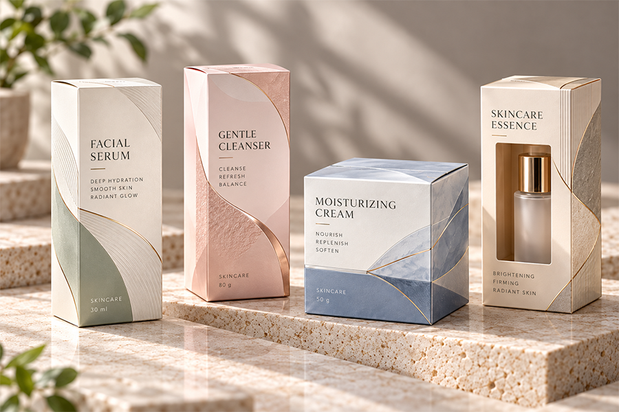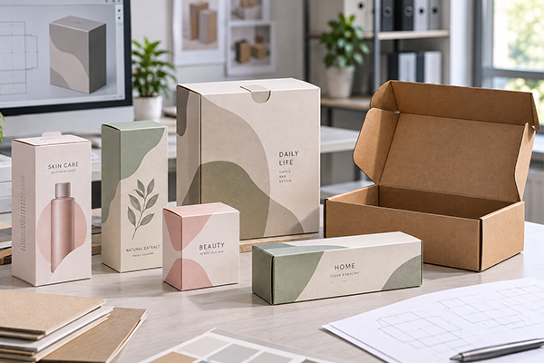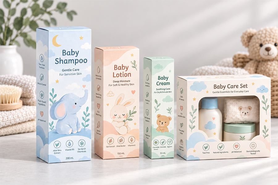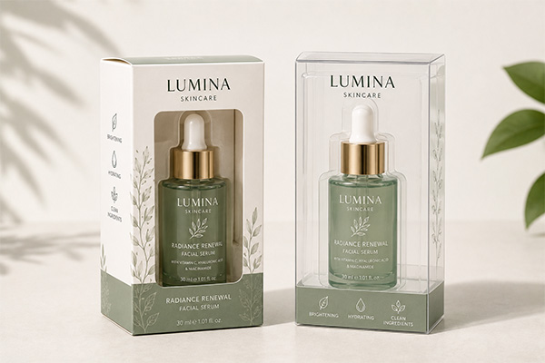
Дизайн упаковки может выглядеть идеально на экране компьютера, но при этом заметно отличаться после печати на бумаге..
Это особенно распространено, когда бренды начинают разрабатывать индивидуальные бумажные коробки и им необходимо сделать выбор между печатью CMYK и Pantone.. Оба метода широко используются в упаковке., но они созданы для разных целей.
CMYK обычно используется, когда в коробке содержатся фотографии., иллюстрации, градиенты, или несколько цветов. Плашечные цвета Pantone более полезны, когда цвет конкретного бренда требует более жесткого контроля или когда желаемый цвет не может быть хорошо воспроизведен с помощью стандартной печати CMYK..
Ни один из методов не является автоматически лучшим.
Красочная коробка для закусок может идеально работать с CMYK., хотя минималист коробка для ухода за кожей построенный на одном фирменном зеленом цвете, может выиграть от Pantone. Некоторые упаковочные проекты используют обе системы одновременно., объединение изображений CMYK с одним фирменным цветом Pantone.
Конечный результат также зависит от того, что дизайнеры иногда упускают из виду.: сама бумага.
Белый картон, крафт-бумага, золотая карта, серебряная карта, lamination, и другие виды обработки поверхности могут изменить внешний вид отпечатанных цветов.. Таким образом, выбор CMYK или Pantone — это лишь часть управления цветом упаковки..
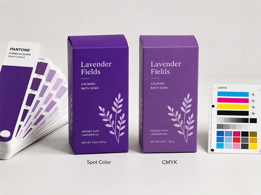
Понимание разницы между CMYK и Pantone
CMYK означает голубой, Пурпурный, Желтый, и ключ, с ключом, относящимся к черному. Эти четыре краски печатаются в различных комбинациях для создания широкого спектра цветов..
Этот процесс делает CMYK особенно полезным для упаковки, содержащей фотографии и сложную графику.. Коробка с фруктами, ящик для игрушек с яркими персонажами, или упаковка косметики с фотографией продукта могут быть воспроизведены с использованием одних и тех же четырех триадных цветов..
Pantone работает по-другому.
Вместо создания цвета путем комбинирования красок CMYK на печатной машине, Плашечный цвет Pantone готовится в виде конкретной краски и печатается отдельно.. Дизайнеры и полиграфисты используют справочные номера Pantone для обозначения предполагаемого цвета..
Это делает Pantone особенно полезным для логотипов и важных цветов бренда..
Компания, которая использует один и тот же синий цвет в своих коробках, этикетки, сумки для покупок, и в рекламных материалах может быть указана ссылка Pantone, чтобы разные поставщики имели более четкие физические целевые цвета..
Однако, Pantone не означает, что цвет будет выглядеть абсолютно одинаково в любых условиях производства.. Бумажный материал, плотность чернил, покрытие, lamination, условия типографии, и освещение все еще может влиять на окончательный внешний вид..
Когда CMYK имеет больше смысла Бумажные коробки
CMYK обычно является практичным выбором, когда упаковка содержит много визуальной информации..
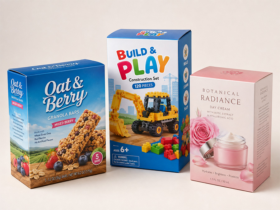
Представьте себе детскую пакет игрушек с голубым небом, зеленый фон, красочные иллюстрации, фотография продукта, тени, и несколько символов. Печать каждого важного цвета отдельно с помощью точечных чернил сделала бы производство неоправданно усложненным..
С CMYK, принтер может воспроизвести все эти элементы, используя четыре триадных цвета..
То же самое относится и к упаковке закусок., косметические коробки, коробки для еды, рекламная упаковка, и многие розничные товары, для которых важны фотографии и красочные иллюстрации..
CMYK также хорошо работает с градиентами.. Если дизайн постепенно меняется со светло-голубого на темно-синий, или от оранжевого к красному, процессная печать может воспроизвести переход естественным образом.
По этой причине, CMYK остается одним из наиболее распространенных методов полноцветной печати на бумажных коробках..
Когда Pantone становится более важным
Pantone становится более полезным, когда конкретный цвет тесно связан с брендом..
Некоторые бренды сразу узнаваемы по одному конкретному оттенку красного., синий, зеленый, или другой фирменный цвет. Если этот цвет заметно меняется при использовании разных упаковочных продуктов или при повторных заказах., общая презентация бренда может стать противоречивой.
Плашечный цвет Pantone обеспечивает более четкое представление об этом важном цвете..
Это особенно полезно для упаковки с относительно простыми изображениями.. В роскошной парфюмерной коробке может использоваться только черный цвет и один цвет Pantone.. Бренд средств по уходу за кожей может использовать большую сплошную зеленую область с небольшим логотипом.. Коробка корпоративного продукта, возможно, должна соответствовать установленным принципам бренда компании..
Плашечные цвета Pantone также могут воспроизводить некоторые яркие или очень насыщенные цвета, которые стандартный CMYK не может точно соответствовать..
Почему CMYK и Pantone могут выглядеть по-разному
Одна из распространенных проблем возникает, когда дизайнеры выбирают цвет Pantone, а затем преобразуют его в CMYK..
Конвертированная версия может выглядеть похожей, но это не обязательно идентично.
CMYK имеет ограниченный цветовой охват для печати.. Немного ярких апельсинов, яркая зелень, интенсивный блюз, флуоресцентные оттенки, и очень насыщенные цвета невозможно точно воспроизвести с помощью стандартной четырехцветной печати..
Как результат, яркий цвет Pantone может выглядеть немного тусклее при преобразовании в CMYK.
Это имеет значение, когда коробка должна соответствовать существующей упаковке., логотип, этикетка, сумка для покупок, или другой фирменный материал.
Для чувствительных к цвету проектов, лучше сравнить физический эталон Pantone и реальный напечатанный образец, а не полагаться только на то, как два цвета выглядят на экране компьютера..
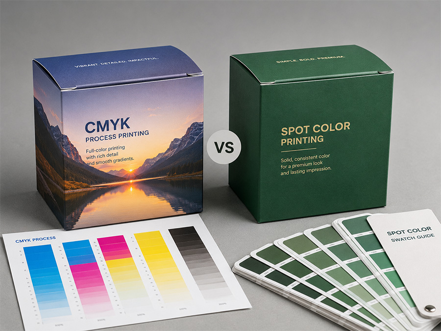
Бумажный материал может изменить окончательный цвет
Выбор между CMYK и Pantone важен., но бумажный материал может так же сильно повлиять на результат.
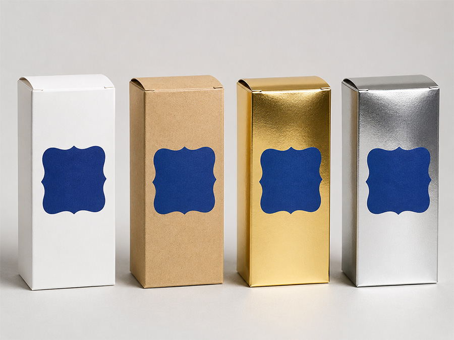
Белый картон обеспечивает относительно нейтральную основу., вот почему его обычно используют для красочных розничная упаковка. Изображения CMYK и цвета Pantone обычно выглядят чище и ярче при печати на белой бумаге..
Крафт-бумага ведет себя по-другому, поскольку материал уже имеет коричневый основной цвет.. Светлые цвета могут стать теплее или темнее, хотя некоторые яркие цвета могут потерять интенсивность. Дизайн, который выглядит свежим и ярким на экране компьютера, может выглядеть намного мягче при печати непосредственно на крафт-бумаге..
Бумага без покрытия также впитывает чернила иначе, чем бумага с покрытием.. Цвета обычно кажутся более мягкими и менее насыщенными.. Вот почему Pantone предоставляет разные обозначения для изделий с покрытием и без покрытия..
Золотая и серебряная карты создают совершенно другую ситуацию.. Металлическая поверхность может проступать сквозь печатную краску и изменять окончательный внешний вид.. Иногда это взаимодействие является намеренным, потому что дизайнер хочет добиться металлического эффекта.. В других проектах, возможно, придется напечатать белые чернила под цветными, чтобы изображение выглядело более похоже на белую бумагу..
Вот почему выбор бумаги должен происходить до окончательного утверждения цвета..
Один только номер Pantone не расскажет всей истории.. Те же чернила, напечатанные на белом картоне., крафт-бумага, и серебряная карта могут создать три заметно разных визуальных результата.
Ламинирование и отделка также влияют на цвет
Цвет может продолжать меняться после печати.
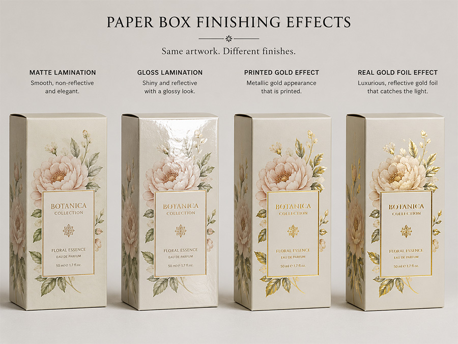
Многие бумажные коробки используют матовую ламинацию., глянцевая ламинация, мягкая на ощупь пленка, лак, пятно УФ, или другие виды обработки поверхности. Каждая отделка по-разному взаимодействует со светом и может изменить восприятие клиентами цвета печати..
Глянцевое ламинирование обычно увеличивает отражение и может сделать цвета более яркими или насыщенными.. Матовое ламинирование часто придает более мягкий внешний вид.. Мягкая на ощупь отделка может создать более глубокий, более премиальная поверхность, но некоторые цвета могут немного отличаться после нанесения пленки..
Это становится важным при утверждении образцов..
Если бренд одобряет неламинированный лист, но в окончательной упаковке используется матовая ламинация, готовая коробка может не выглядеть точно так же, как утвержденный отпечаток..
Для важных цветов упаковки, лучше оценивать готовый образец по реальной бумаге, печать, и обработка поверхности запланирована на производство.
Тот же принцип применим к тиснению фольгой и металлическим эффектам..
Дизайн CMYK может визуально имитировать золотой цвет., но стандартные чернила CMYK не могут создать настоящее металлическое отражение. Если дизайн требует настоящего блестящего золотого эффекта, металлические чернила, золотая фольга, или металлическую бумагу следует рассматривать вместо этого.
CMYK и Pantone можно использовать вместе
Дизайнерам упаковки не всегда нужно выбирать только одну систему печати..
Многие коммерческие бумажные коробки сочетают в себе цвета CMYK и Pantone..
Например, а косметическая коробка можно использовать CMYK для изображения продукта и фоновой графики, а для логотипа бренда использовать зеленый цвет Pantone.. На упаковке продуктов питания можно использовать CMYK для иллюстраций фруктов, сохраняя при этом красный цвет основного бренда в качестве плашечного цвета..
Этот подход сочетает в себе гибкость полноцветной печати с более строгим контролем над одним важным цветом бренда..
Основное внимание уделяется сложности производства.. В обычной офсетной печати, добавление цвета Pantone к дизайну CMYK обычно означает добавление еще одной печатной формы и другой краски..
В задании CMYK используются четыре триадных цвета.. CMYK плюс один Pantone становится пятицветной работой.
Это может повлиять на организацию производства и стоимость..
Однако, Pantone не всегда является более дорогим выбором.. Простой дизайн упаковки с использованием только одного или двух плашечных цветов может оказаться простым в изготовлении..
Художественное произведение должно определять метод печати, а не использовать фиксированные правила, такие как «CMYK дешевле» или «Pantone всегда премиум».
Что происходит с повторными заказами?
При повторных заказах контроль цвета становится особенно заметен..
Бренд может заказать одну и ту же косметичку или продуктовую упаковку несколько раз в течение года.. В идеале, новая продукция должна оставаться визуально близкой к предыдущей партии.
Pantone предоставляет полезный стандартизированный стандарт для важных цветов бренда., но это не устраняет всех вариаций.
Партии бумаги могут незначительно измениться. Условия печати могут различаться. Плотность чернил, lamination, сушка, и даже освещение может повлиять на восприятие цветов.
Производство CMYK также требует правильного управления цветом для обеспечения единообразия..
Для повторных заказов, сохранение утвержденного физического образца из более ранней производственной партии может быть чрезвычайно полезным.. Принтер может напрямую сравнивать новую продукцию с предыдущей одобренной коробкой, а не полагаться только на файл графического изображения или изображение на мониторе..
Реалистичная цель не всегда заключается в абсолютном нулевом цвете.. Печать — это физический производственный процесс.. Цель состоит в том, чтобы контролировать вариации в пределах приемлемого диапазона и поддерживать единый внешний вид бренда..
Почему цвет экрана не является надежным стандартом печати
Еще одним распространенным источником путаницы является экран компьютера..
Экраны обычно отображают цвета с использованием света RGB., при печати цвет создается физическими чернилами.
Одно и то же изображение может выглядеть по-разному на ноутбуке., смартфон, офисный монитор, или профессионально откалиброванный дисплей.
Яркость экрана может сделать цвета более яркими, чем на бумаге..
Вот почему принтеру сложно точно следовать таким инструкциям, как «сделай коробку точно такого же синего цвета, как экран моего телефона»..
Для критических цветов, бренды должны предоставить ссылку Pantone, утвержденный печатный образец, или другой физический стандарт цвета, если это возможно..
Для изображений CMYK, правильно подготовленная корректура или распечатанный образец дают гораздо более реалистичную информацию, чем скриншот.
CMYK против Pantone: Быстрое сравнение
| Фактор | CMYK | Пантон |
|---|---|---|
| Фотографии | Очень подходит | Обычно не используется отдельно |
| Сложные иллюстрации | Очень подходит | Менее практично |
| Градиенты | Очень подходит | Ограничено для сложных проектов. |
| Однотонные фирменные цвета | Хороший | Лучший контроль |
| Очень яркие цвета | Ограничено гаммой CMYK | Часто лучше |
| Металлические/флуоресцентные цвета | Невозможно создать истинный эффект | Доступны специальные точечные чернила. |
| Полноцветная розничная упаковка. | Очень практично | Обычно сочетается с CMYK. |
| Простой- или двухцветная коробка | Возможный | Часто практично |
| Повторите ссылку на цвет бренда | Хорошо при правильном контроле | Сильная стандартизированная ссылка |
Это сравнение является лишь отправной точкой.. Фактические производственные решения зависят от произведения искусства., материал, печатное оборудование, количество заказа, отделка, и требуемая цветовая толерантность.
Распространенные проблемы с цветом при печати на бумажных коробках
Многие проблемы с цветом упаковки возникают из-за ожиданий, а не из-за самого метода печати..
Дизайнер может преобразовать цвет Pantone в CMYK, не проверяя, насколько изменяется цвет.. Заказчик может утвердить работу только с экрана.. Бренд может перейти с белого картона на крафт-бумагу, но ожидать точно такого же цветового результата..
Другие проблемы возникают при добавлении матовой ламинации после того, как цвет уже утвержден., или когда ожидается, что цифровой эффект «золота» будет выглядеть на готовой коробке как настоящая фольга.
Эти ситуации показывают, почему цвет печати следует рассматривать как часть целостной структуры упаковки..
произведение искусства, чернила, бумага, покрытие, lamination, и заканчиваем всю работу вместе.
Почему печатные образцы имеют значение
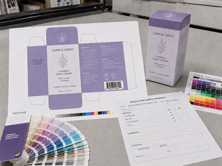
Для цветочувствительных бумажных коробок, физический отбор проб — один из наиболее полезных шагов перед массовым производством..
Образец позволяет бренду увидеть, как настоящие чернила взаимодействуют с выбранной бумагой.. Также показано, как меняется дизайн после ламинирования., тиснение фольгой, тиснение, или другая отделка.
Это особенно полезно для темных однотонных цветов., Цвета бренда Pantone, крафт-бумага, металлическая карта, большие области чернил, и упаковка с несколькими процессами отделки.
Цифровая проба может подтвердить макет и общее цветовое направление., но он не может полностью воспроизвести внешний вид печатной бумаги..
Для важных упаковочных проектов, Ближайшим отсылкой к конечному производству является образец, изготовленный из материалов и процессов, аналогичных тем, которые запланированы для оптового заказа..
Заключительные мысли
CMYK и Pantone не являются конкурирующими методами печати, где один всегда лучше другого..
Они решают различные потребности в упаковке.
CMYK обычно является лучшим выбором для фотографий., иллюстрации, градиенты, и дизайны, содержащие много цветов. Pantone становится более полезным, когда цвет конкретного бренда требует более строгого контроля или когда желаемый цвет выходит за рамки практического диапазона стандарта CMYK..
Некоторые бумажные коробки выигрывают от сочетания того и другого..
Что еще более важно, на окончательный цвет влияет гораздо больше, чем просто система чернил. Бумажный материал, покрытие, lamination, фольга, Условия производства влияют на внешний вид готовой упаковки..
Для брендов, которые заботятся о постоянстве цвета, лучший подход — заранее определиться с методом печати и материалом бумаги., четко определите важные цветовые ссылки, и подтвердите физический образец перед массовым производством.
Хорошее управление цветом упаковки – это не просто выбор CMYK или Pantone.. Речь идет о контроле всего пути от произведения искусства до готовой бумажной коробки..