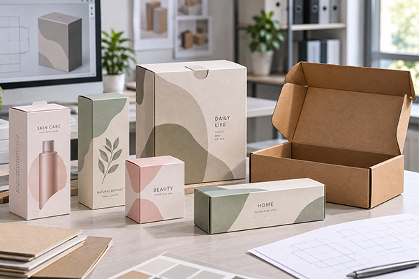
A packaging design can look perfect on a computer screen and still appear noticeably different once it is printed on paper.
This is especially common when brands begin developing custom paper boxes and need to decide between CMYK and Pantone printing. Both methods are widely used in packaging, but they are designed for different purposes.
CMYK is commonly used when a box contains photographs, illustrations, gradients, or several colors. Pantone spot colors are more useful when a specific brand color needs tighter control or when the desired color cannot be reproduced well through standard CMYK printing.
Neither method is automatically better.
A colorful snack box may work perfectly with CMYK, while a minimalist skincare box built around one signature green may benefit from Pantone. Some packaging projects use both systems at the same time, combining CMYK artwork with one Pantone brand color.
The final result also depends on something designers sometimes overlook: the paper itself.
White cardboard, kraft paper, gold card, silver card, lamination, and other surface treatments can all change the way printed colors appear. Choosing CMYK or Pantone is therefore only one part of packaging color management.
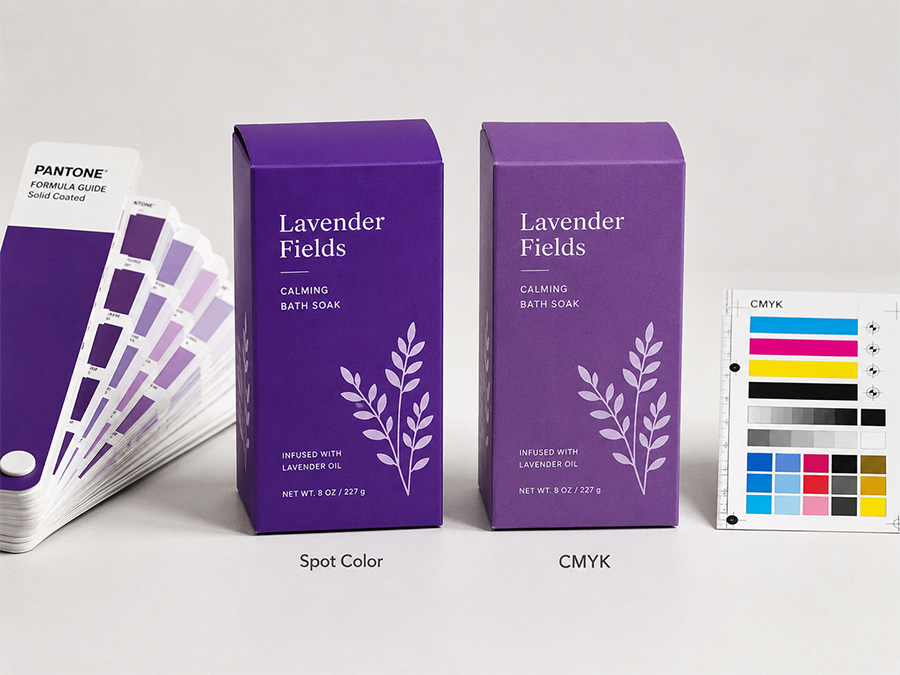
Understanding the Difference Between CMYK and Pantone
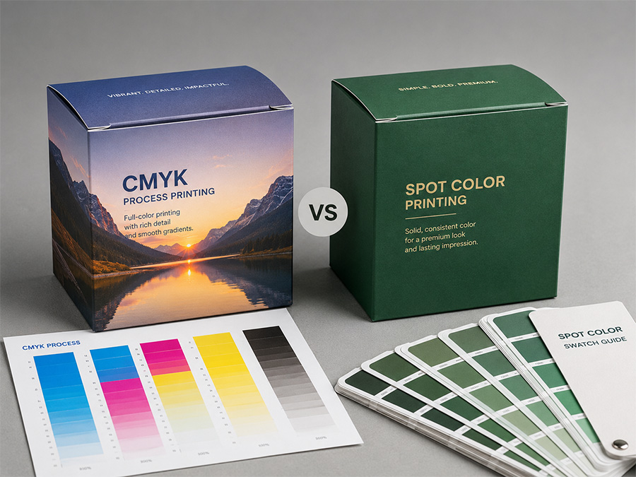
CMYK stands for Cyan, Magenta, Yellow, and Key, with Key referring to black. These four inks are printed in different combinations to create a wide range of colors.
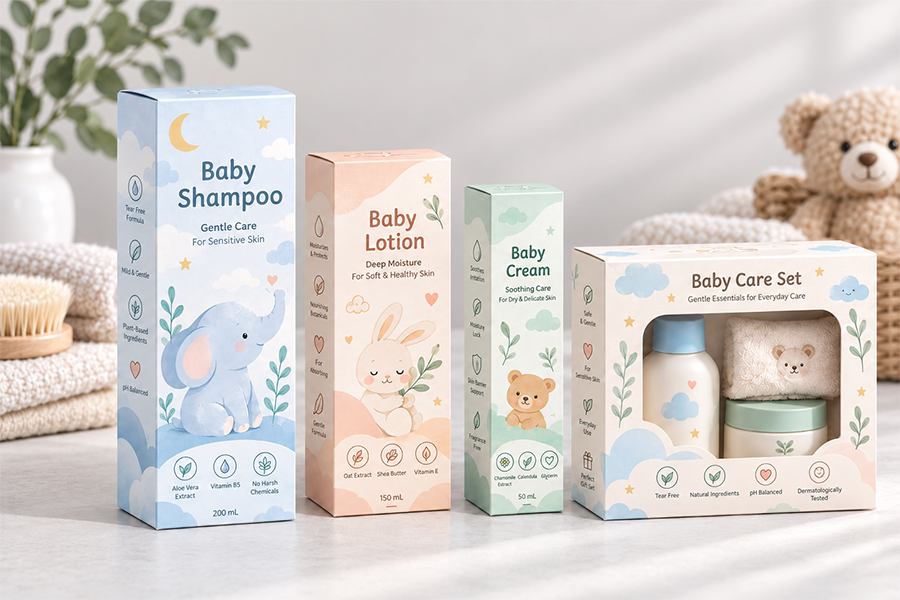
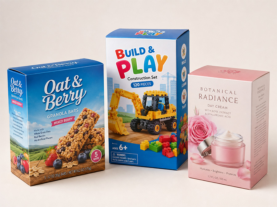
This process makes CMYK particularly useful for packaging containing photographs and complex graphics. A food box showing fruit, a toy box with colorful characters, or a cosmetic package with product photography can all be reproduced using the same four process colors.
Pantone works differently.
Instead of creating a color by combining CMYK inks on the press, a Pantone spot color is prepared as a specific ink and printed separately. Designers and printers use Pantone reference numbers to communicate the intended color.
This makes Pantone particularly useful for logos and important brand colors.
A company that uses the same blue across its boxes, labels, shopping bags, and promotional materials may specify a Pantone reference so different suppliers have a clearer physical color target.
However, Pantone does not mean a color will look absolutely identical under every production condition. Paper material, ink density, coating, lamination, printing press conditions, and lighting can still influence the final appearance.
When CMYK Makes More Sense for Paper Boxes
CMYK is usually the practical choice when packaging contains a lot of visual information.
Imagine a children’s toy package with a blue sky, green background, colorful illustrations, product photography, shadows, and multiple characters. Printing each important color separately with spot inks would make production unnecessarily complicated.
With CMYK, the printer can reproduce all of these elements using four process colors.
The same applies to snack packaging, cosmetic cartons, food boxes, promotional packaging, and many retail products where photographs and colorful artwork are important.
CMYK also works well with gradients. If a design changes gradually from light blue to dark blue, or from orange to red, process printing can reproduce the transition naturally.
For this reason, CMYK remains one of the most common methods for full-color paper box printing.
When Pantone Becomes More Important
Pantone becomes more useful when a particular color is closely connected to the brand.
Some brands are immediately recognizable because of one specific shade of red, blue, green, or another signature color. If that color changes noticeably between different packaging products or repeat orders, the overall brand presentation can become inconsistent.
A Pantone spot color provides a clearer reference for that critical color.
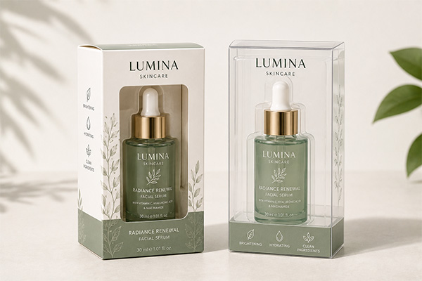
This is especially useful for packaging with relatively simple artwork. A luxury perfume box may use only black and one Pantone color. A skincare brand may use a large solid green area with a small logo. A corporate product box may need to match the company’s established brand guidelines.
Pantone spot colors can also reproduce some bright or highly saturated colors that standard CMYK cannot match closely.
Why CMYK and Pantone Can Look Different
One common problem occurs when designers select a Pantone color and later convert it into CMYK.
The converted version may appear similar, but it is not necessarily identical.
CMYK has a limited printable color gamut. Some bright oranges, vivid greens, intense blues, fluorescent shades, and highly saturated colors cannot be reproduced exactly with standard four-color printing.
As a result, a vivid Pantone color may look slightly duller when converted into CMYK.
This matters when the box needs to match an existing package, logo, label, shopping bag, or other branded material.
For color-sensitive projects, it is better to compare a physical Pantone reference and an actual printed sample instead of relying only on how the two colors look on a computer screen.
Paper Material Can Change the Final Color
The choice between CMYK and Pantone is important, but paper material can affect the result just as much.
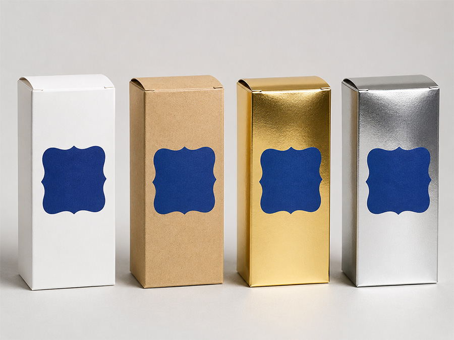
White cardboard provides a relatively neutral base, which is why it is commonly used for colorful retail packaging. CMYK images and Pantone colors generally appear cleaner and brighter when printed on white stock.
Kraft paper behaves differently because the material already has a brown base color. Light colors may become warmer or darker, while some bright colors may lose intensity. A design that looks fresh and bright on a computer screen may appear much softer when printed directly onto kraft paper.
Uncoated paper also absorbs ink differently from coated paper. Colors generally appear softer and less saturated. This is why Pantone provides different references for coated and uncoated applications.
Gold and silver card create another situation entirely. The metallic surface can show through the printed ink and change the final appearance. Sometimes this interaction is intentional because the designer wants a metallic effect. In other projects, white ink may need to be printed beneath the color so that the artwork appears more like it would on white paper.
This is why paper selection should happen before final color approval.
A Pantone number alone does not tell the complete story. The same ink printed on white cardboard, kraft paper, and silver card can create three noticeably different visual results.
Lamination and Finishing Also Affect Color
Color can continue to change after printing.
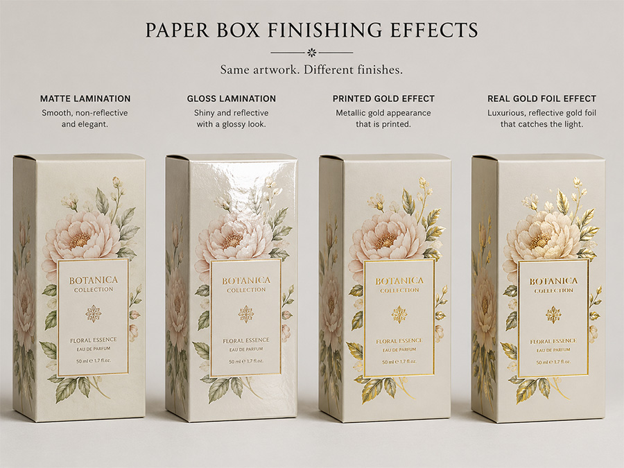
Many paper boxes use matte lamination, gloss lamination, soft-touch film, varnish, spot UV, or other surface treatments. Each finish interacts with light differently and can change how customers perceive the printed color.
Gloss lamination usually increases reflection and may make colors appear stronger or more saturated. Matte lamination often produces a softer visual appearance. Soft-touch finishes can create a deeper, more premium surface, but some colors may also appear slightly different after the film is applied.
This becomes important when approving samples.
If a brand approves an unlaminated sheet but the final packaging uses matte lamination, the finished box may not look exactly like the approved print.
For important packaging colors, it is better to evaluate a finished sample using the actual paper, printing, and surface treatment planned for production.
The same principle applies to foil stamping and metallic effects.
A CMYK design can simulate a gold color visually, but standard CMYK ink cannot create real metallic reflection. If the design requires a true shiny gold effect, metallic ink, gold foil, or metallic paper should be considered instead.
CMYK and Pantone Can Be Used Together
Packaging designers do not always need to choose only one printing system.
Many commercial paper boxes combine CMYK and Pantone.
For example, a cosmetic box may use CMYK for a product image and background graphics while using a Pantone green for the brand logo. A food package may use CMYK for fruit illustrations while keeping the main brand red as a spot color.
This approach combines the flexibility of full-color printing with stronger control over one important brand color.
The main consideration is production complexity. In conventional offset printing, adding a Pantone color to a CMYK design usually means adding another printing plate and another ink.
A CMYK job uses four process colors. CMYK plus one Pantone becomes a five-color job.
That can affect production setup and cost.
However, Pantone is not always the more expensive choice. A simple packaging design using only one or two spot colors may actually be straightforward to produce.
The artwork should determine the printing method rather than using a fixed rule such as “CMYK is cheaper” or “Pantone is always premium.”
What Happens with Repeat Orders?
Repeat orders are where color control becomes particularly noticeable.
A brand may order the same cosmetic box or food package several times during the year. Ideally, the new production should remain visually close to the previous batch.
Pantone provides a useful standardized target for important brand colors, but it does not eliminate all variation.
Paper batches may change slightly. Printing press conditions can vary. Ink density, lamination, drying, and even lighting can affect how colors are perceived.
CMYK production also requires proper color management to maintain consistency.
For repeat orders, keeping an approved physical sample from an earlier production batch can be extremely useful. The printer can compare the new production directly with the previous approved box rather than relying only on an artwork file or monitor display.
The realistic goal is not always absolute zero color difference. Printing is a physical manufacturing process. The goal is to control variation within an acceptable range and maintain a consistent overall brand appearance.
Why Screen Color Is Not a Reliable Printing Standard
Another common source of confusion is the computer screen.
Screens normally display color using RGB light, while printing creates color with physical inks.
The same artwork may also look different on a laptop, smartphone, office monitor, or professionally calibrated display.
Screen brightness can make a color appear much more vivid than it will on paper.
This is why instructions such as “make the box exactly the same blue as my phone screen” are difficult for a printer to follow accurately.
For critical colors, brands should provide a Pantone reference, approved printed sample, or another physical color standard whenever possible.
For CMYK artwork, a properly prepared proof or printed sample gives a much more realistic reference than a screenshot.
CMYK vs Pantone: Quick Comparison
| Factor | CMYK | Pantone |
|---|---|---|
| Photographs | Very suitable | Usually not used alone |
| Complex illustrations | Very suitable | Less practical |
| Gradients | Very suitable | Limited for complex designs |
| Solid brand colors | Good | Better control |
| Very bright colors | Limited by CMYK gamut | Often better |
| Metallic/fluorescent colors | Cannot create true effect | Specialty spot inks available |
| Full-color retail packaging | Highly practical | Usually combined with CMYK |
| Simple one- or two-color box | Possible | Often practical |
| Repeat brand color reference | Good with proper control | Strong standardized reference |
This comparison is only a starting point. Actual production decisions depend on the artwork, material, printing equipment, order quantity, finishing, and required color tolerance.
Common Color Problems in Paper Box Printing
Many packaging color problems come from expectations rather than the printing method itself.
A designer may convert a Pantone color into CMYK without checking how much the color changes. A customer may approve the artwork only from a screen. A brand may change from white cardboard to kraft paper but expect exactly the same color result.
Other problems appear when matte lamination is added after the color has already been approved, or when a digital “gold” effect is expected to look like real foil on the finished box.
These situations show why printing color should be considered as part of the complete packaging structure.
The artwork, ink, paper, coating, lamination, and finishing all work together.
Why Printed Samples Matter
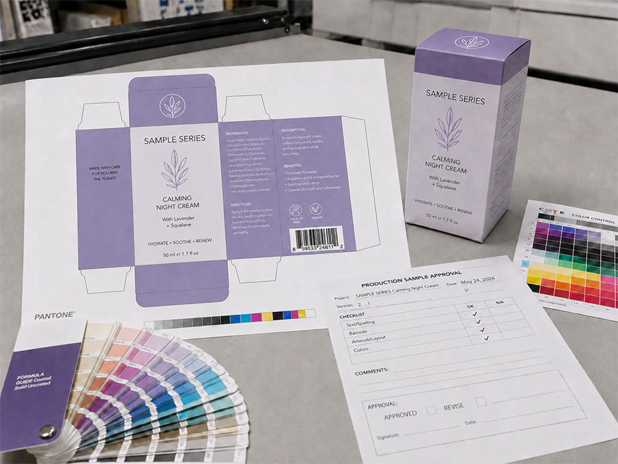
For color-sensitive paper boxes, physical sampling is one of the most useful steps before mass production.
A sample allows the brand to see how the actual ink interacts with the selected paper. It also shows how the design changes after lamination, foil stamping, embossing, or other finishing.
This is particularly useful for dark solid colors, Pantone brand colors, kraft paper, metallic card, large ink areas, and packaging with several finishing processes.
A digital proof can confirm layout and general color direction, but it cannot fully reproduce the physical appearance of printed paper.
For important packaging projects, the closest reference to final production is a sample made with materials and processes similar to those planned for the bulk order.
Final Thoughts
CMYK and Pantone are not competing printing methods where one is always better than the other.
They solve different packaging needs.
CMYK is usually the better choice for photographs, illustrations, gradients, and designs containing many colors. Pantone becomes more useful when a specific brand color needs stronger control or when the desired color falls outside the practical range of standard CMYK.
Some paper boxes benefit from combining both.
More importantly, the final color is influenced by much more than the ink system. Paper material, coating, lamination, foil, and production conditions all affect how the finished package looks.
For brands that care about color consistency, the best approach is to decide the printing method and paper material early, define important color references clearly, and confirm a physical sample before mass production.
Good packaging color management is not simply about choosing CMYK or Pantone. It is about controlling the complete path from artwork to the finished paper box.