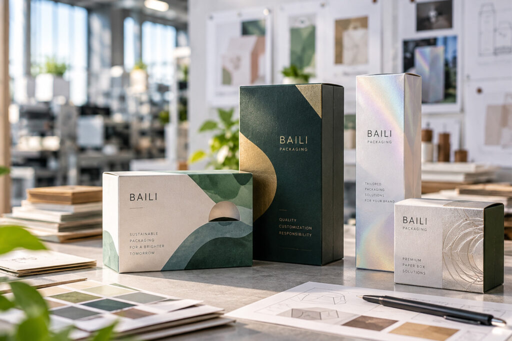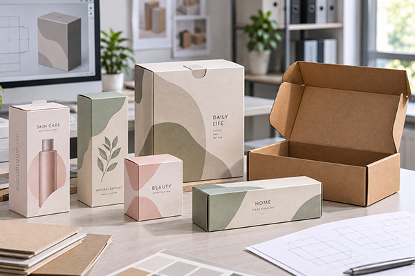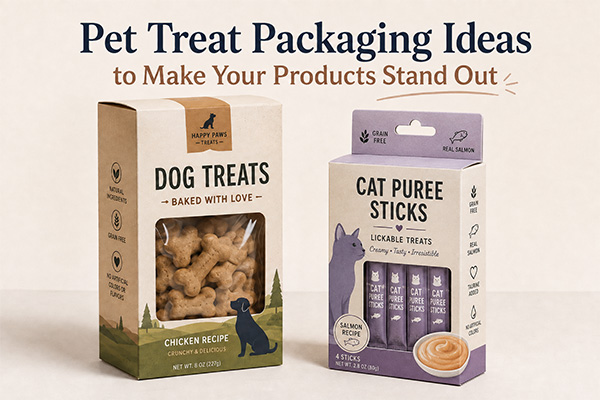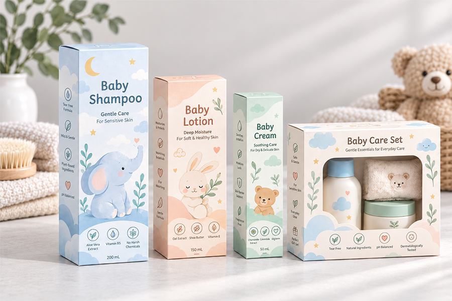
Pregúntele a la mayoría de la gente para qué sirve el embalaje., y dirán dos cosas: proteger el producto, hacerlo vendible. Me parece bien. Pero camine por cualquier pasillo de refrigerios o desplácese por la página de la tienda de una marca de té, y notarás que el empaque silenciosamente hace mucho más: te dice lo que hay dentro antes de que leas una palabra., insinuando si se trata de una merienda del martes por la tarde o un regalo para la suegra de alguien, y hacer que las galletas de una marca no se parezcan en nada a la marca de al lado.
Ésa es en gran parte la razón por la que las cajas de papel no han desaparecido, incluso con todas las bolsas flexibles y opciones de envoltura retráctil que existen. Una caja plegada proporciona a la marca una superficie real: espacio para imprimir, espacio para explicar, espacio para parecerse algo en lugar de nada. Los bolsos y las etiquetas lisas rara vez ofrecen el mismo lienzo.
El problema es que la comida no es como la funda de un teléfono o una vela.. Viene con su propia lista de preocupaciones: la humedad., aceite, aroma, duración, y en algunos casos, reglas estrictas de contacto con alimentos. Por eso, una caja de papel para un refrigerio o un producto de café no suele ser la única capa del embalaje.; Por lo general, funciona junto con una bolsa interior., transatlántico, o bandeja que hace el trabajo real de mantener los alimentos frescos y seguros.
Consigue ese equilibrio correcto, y una caja de papel puede verse genial y funcionar correctamente. hazlo mal, y terminas con una hermosa caja que contiene té rancio. Así es como las marcas están abordando los envases de cajas de papel para alimentos en sus snacks, té, café, y regalar.
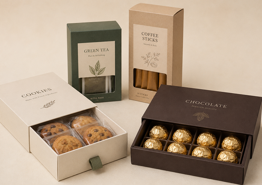
Por qué las cajas de papel todavía tienen sentido para los alimentos
El espacio de impresión es la razón obvia. Paneles de nutrición, certificaciones, instrucciones de preparación, notas de sabor, la historia de un fundador - un cartón plegable puede llevarlo todo sin verse desordenado, algo que una pequeña pegatina en una bolsa simplemente no puede lograr.
También está el efecto organizador. Una caja llena de bolsitas de té., palitos de café, o chocolates envueltos parece intencional. Los mismos artículos sueltos en un bolso parecen una ocurrencia tardía. Esa estructura es aún más importante a la hora de regalar: una lata de té en una bolsita sencilla se lee como “producto.” La misma lata dentro de un cajón impreso dice: “regalo.”
Y el papel es flexible como material., que es fácil de olvidar. El papel kraft se inclina por lo rústico y lo orgánico. La pizarra blanca revestida absorbe la tinta a la perfección para trabajos de impresión de primera calidad.. El material corrugado sobrevive al envío. Una familia de materiales, varios looks completamente diferentes.
Una cosa que vale la pena decir claramente: una caja de papel no es automáticamente apta para alimentos solo porque esté hecha de papel. Si la comida va a tocar la caja directamente, el carton, tinta, revestimiento, y el adhesivo deben ser apropiados para ese contacto: reguladores como el FDA en los EE.UU. y el Comisión Europea Ambos tratan los materiales de embalaje que entran en contacto con los alimentos como algo que debe verificarse., no asumido. Honestamente, para la mayoría de los bocadillos, té, y productos de cafe, Es más sencillo y seguro dejar que la caja sea la capa exterior mientras que un envoltorio o bolsa interior se encarga de la parte segura para los alimentos..
Aperitivos: Las decisiones rápidas necesitan una comunicación rápida
Nadie delibera sobre una bolsa de galletas como lo haría con una botella de vino.. El empaque de los refrigerios tiene quizás dos o tres segundos para transmitir su mensaje: el sabor., cantidad, ambiente: antes de que la mano de alguien pase al siguiente estante.
Las cajas de papel aparecen constantemente:
- Dulce
- Galletas y galletas
- galletas saladas
- Nueces y frutos secos
- barras de chocolate
- Bocadillos de granola
- Surtidos de snacks en paquetes múltiples
- Golosinas envueltas individualmente
Cuando una caja contiene varios paquetes más pequeños
Piense en una caja de galletas variadas: seis sabores, cada uno en bolsas individuales, todo dentro de una caja impresa. Esa caja exterior no es solo un contenedor; esta haciendo la venta. Es donde los nombres de los sabores., el “6 variedades dentro,” la pequeña ilustración de lo que hay en cada bolsa todo en vivo. Esta configuración aparece mucho en las tiendas de regalos., tapas de supermercado, y paquetes de refrigerios en línea donde los clientes no pueden recoger e inspeccionar físicamente cada artículo.
Codificar por colores en lugar de leer
Aquí tienes un pequeño truco que funciona mejor de lo que la gente espera: deja que el color haga la clasificación. El verde suele indicar matcha o menta.. Rojo magro fresa o algo picante.. Marrón se lee como chocolate o café.. Alguien que escudriñe un estante a cinco pies de distancia puede identificar su sabor antes de leer una sola palabra, lo cual, en una categoría basada en la compra impulsiva, es basicamente el juego completo.
ventanas: Espectáculo, No te limites a decir
Para productos donde la apariencia vende: chocolates brillantes, caramelos de colores, una galleta bien dorada: una ventana cortada en la caja puede resultar más convincente que cualquier redacción publicitaria. El truco es la moderación: una ventana demasiado grande debilita la estructura de la caja, y para cualquier cosa aceitosa o quebradiza, la comida todavía necesita su propia bolsa o bandeja interior. El La ventana debe mostrar el producto., no tocarlo directamente.
Estructura a juego con el refrigerio
Una caja de cartón plegable se adapta a algo ligero: unas cuantas galletas, un puñado de dulces. Los paquetes múltiples más pesados a menudo necesitan un fondo con bloqueo automático para brindar soporte.. ¿Quieres que el refrigerio se sienta un poco especial?? Un cajón ralentiza la apertura y añade un poco de ceremonia.. Una funda envuelta alrededor de una bandeja interior funciona bien para barras de chocolate o piezas variadas.. La estructura debe coincidir con la forma en que realmente se manipulará el producto: se transportará, apilados, enviado, abierto, no solo como se ve en un render.
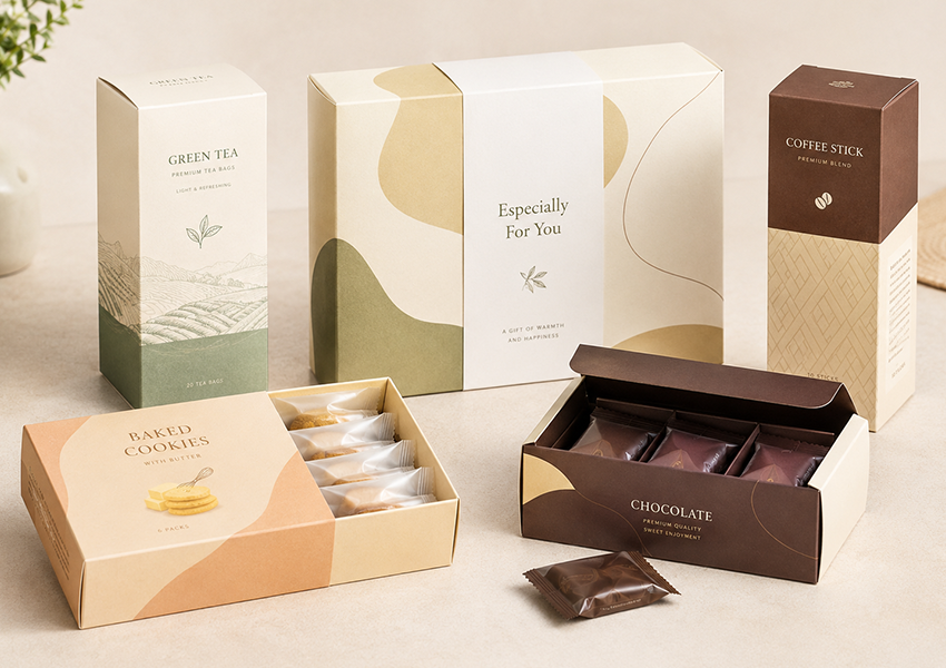
Té: Envases que deben sentirse tranquilos
El té se vende tanto por el estado de ánimo como por el sabor. Nadie quiere que su té de bienestar parezca pertenecer al lado de una bolsa de ositos de goma: el envase tiene que susurrar “calidad” y “cuidado,” no gritar.
Los trabajos comunes de envasado de té incluyen:
- Cajas de bolsitas de té
- Cajas exteriores para latas de hojas sueltas
- Cajas de bolsitas de té de hierbas
- Cajas de polvo de matcha
- Juegos de muestra de té
- Cajas de regalo de té de temporada
- Colecciones de té premium
Los divisores convierten una caja en una historia
Una línea de té de bienestar podría incluir una mezcla matutina, una mezcla para dormir, una mezcla desintoxicante, y una simple opción a base de hierbas: cuatro productos muy diferentes que deben sentirse como un conjunto coherente. Los divisores internos hacen ese trabajo. En lugar de cuatro bolsas sueltas y ruidosas, cada variedad tiene su propio compartimento, y la caja dice "curada en lugar de abarrotada".
La compensación del papel Kraft
El papel kraft es la opción preferida para las marcas de tés orgánicos y de hierbas., y es fácil ver por qué: tan cálido, El marrón sin teñir se siente honesto de una manera que la pizarra blanca brillante no lo hace.. Pero esto conlleva un verdadero compromiso: Los colores impresos son más oscuros y opacos en papel kraft que en cartón blanco.. Para una marca que se inclina por los tonos tierra, bocetos de plantas, o una sensación hecha a mano, eso es una ventaja. Para una marca que necesita un brillo, color impactante para imprimir verdadero, Kraft puede ser la decisión equivocada.
El té premium quiere moderación, No más gráficos
Contraintuitivamente, cuanto más caro es el té, cuanto menos tiende a decir la caja. tipografía limpia, un solo logo en relieve, un toque de lámina de oro, laminación mate sobre un color neutro intenso: esa confianza tranquila a menudo se considera más premium que una ajetreada, diseño colorido jamás podría.
La caja no es lo que mantiene fresco el té
El té pierde aroma rápidamente cuando se expone al aire y la humedad.. La caja de papel cuenta la historia de la marca.; un sobre interior sellado, estaño, o bolsa hace el trabajo real de proteger las hojas. Salta esa capa interior, y ni siquiera la caja más bonita evitará que el té se eche a perder.
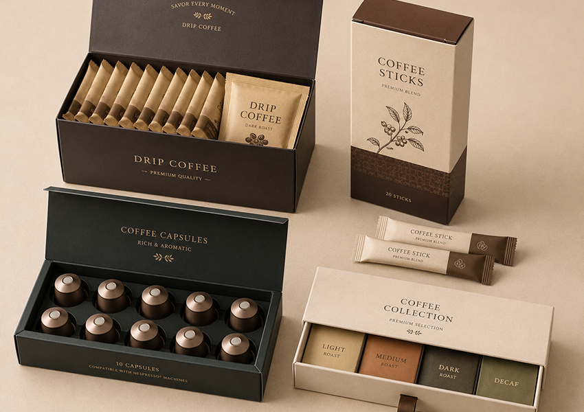
Café: Donde el aroma es el producto real
Los compradores de café compran tanto el olor como el sabor, por lo que el empaque tiene un trabajo ligeramente diferente aquí: debe proteger ese aroma y al mismo tiempo proyectar el nivel de tueste., origen, y estado de ánimo en el estante.
Aparecen cajas de papel para:
- Cajas de palitos de café
- Cajas de café de goteo
- Cajas exteriores de cápsulas
- Cajas de bolsitas de café instantáneo
- Set de regalo y muestrarios de café.
- Cartones de exhibición al por menor
- Cajas de café de suscripción
Las barritas y las bolsitas son naturalmente aptas para cajas
Dado que cada barra o bolsita de café normalmente ya viene sellada por sí sola, la caja exterior es libre de centrarse únicamente en la comunicación: nivel de tueste, notas de sabor, recuento de palos, método de preparación, certificaciones, la historia de fondo de la marca. Una simple caja plegable se encarga de este problema para el comercio minorista diario.; una cajonera o una estructura rígida realzan las cosas para un juego de regalo premium.
Creación de un código de color a nivel de tueste
El tueste claro a menudo termina en un suave color beige o amarillo.. El asado medio se asienta en un color marrón cálido.. El asado oscuro se vuelve marrón oscuro o negro. El descafeinado con frecuencia se vuelve azul o verde para separarlo visualmente de la línea con cafeína.. El café aromatizado vincula su color al sabor mismo: vainilla, caramelo, avellana. Nada de esto es requerido por la ley., pero hace que una línea de café con varios SKU sea fácil de comprar de un vistazo.
Negrita sobre gráficos ocupados
Los envases de café tienden a saltarse el arcoíris de colores en el que se apoyan los envases de snacks. tipografía fuerte, un mapa de origen, una simple ilustración de frijol, formas geométricas limpias, que más sobrias, El aspecto casi arquitectónico tiende a indicar seriedad sobre el producto., Lo cual es importante para los bebedores de café que se preocupan por el origen y el tueste..
La caja no mantiene el café fresco, el embalaje de barrera sí lo hace
Una caja de cartón es porosa.. No impedirá que el oxígeno o la humedad lleguen al café molido., y eso es exactamente lo que arruina el sabor con el tiempo.. Sobres, bolsas forradas con papel de aluminio, o las cápsulas hacen ese trabajo; la caja de papel está ahí para la marca y la presencia minorista, no preservación. Esta distinción es más importante para el café molido., bolsas de goteo, café instantáneo, y cápsulas, todas las cuales se degradan rápidamente una vez expuestas al aire.
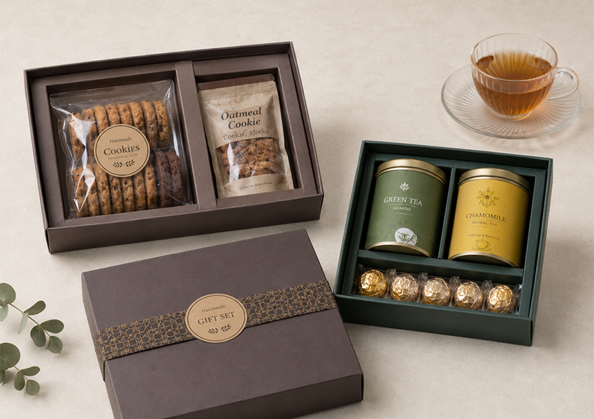
Regalos de comida: Ralentizar el desempaquetado
Los envases de regalo siguen reglas diferentes a los envases minoristas cotidianos. Nadie toma una caja de regalo de un estante en tres segundos; el objetivo es hacer que alguien se detenga, apreciar la apertura, y siento como si hubiera pensado un poco en ello.
Las cajas de regalo de comida suelen cubrir:
- Juegos de chocolates
- Set de regalo de té y café.
- Colecciones de cookies
- Surtidos de dulces
- Cajas de bocadillos navideños
- cajas de regalo de panadería
- Regalos corporativos de comida
- Embalaje festivo
Cajas Rígidas Señal “Esto cuesta algo”
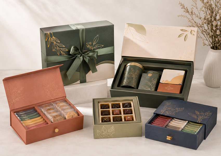
Hay una razón por la que los juegos de regalo de chocolate rara vez vienen en una caja plegable y endeble: el cartón rígido tiene un peso y una estructura que una caja delgada simplemente no puede imitar.. Tapas desmontables, cajas de cajón, aberturas estilo libro, cierres magnéticos: todos estos ralentizan el desembalaje a propósito, Y esa pausa es parte de lo que hace que un regalo se sienta como un regalo..
Los insertos hacen el trabajo silencioso
Un set de regalo con cinco artículos diferentes, por ejemplo, dos barras de chocolate, una lata de té, y dos paquetes de galletas: necesita algo que lo mantenga todo en su lugar, o llega como un lío revuelto. Cartón insertos, bandejas de pulpa moldeada, recortes de espuma, sea cual sea el material, El inserto debe construirse alrededor de las dimensiones reales del producto.. Demasiado espacio vacío y la caja parece medio vacía; demasiado apretado y parece un apretón.
Reutilizar una caja cada día festivo
Rediseñando el packaging para Navidad, año nuevo lunar, Día de San Valentín, y el Día de la Madre por separado se vuelve caro rápidamente. Un movimiento más inteligente: mantenga una caja base neutral y cámbiela por una funda de temporada, banda del vientre, o etiquetar cada vez. Mismas herramientas, misma tirada de producción, una sensación estacional completamente diferente.
No dejes “De primera calidad” Convertirse “Poco práctico”
Es fácil diseñar demasiado una caja de regalo: un cartón más pesado aumenta el costo de envío, Un pliegue complicado ralentiza las líneas de embalaje., y una caja de gran tamaño hace que incluso un regalo generoso parezca escaso por dentro. El mejor embalaje de regalo para alimentos encuentra el punto en el que sigue teniendo un aspecto especial pero no crea dolores de cabeza en el almacén..
Cajas de ventana: Deje que el producto se venda solo
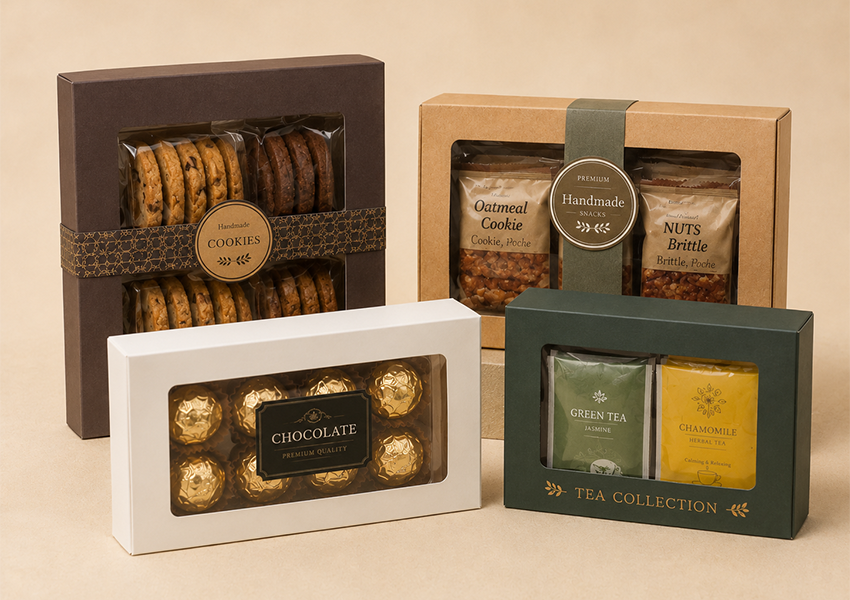
A veces la forma más rápida de vender comida es simplemente mostrarla.. Una ventana permite al cliente ver la cookie real, el chocolate real, sin siquiera abrir el paquete: un atajo que funciona especialmente bien para cualquier cosa visualmente atractiva.
Windows aparece con frecuencia en:
- Galletas
- bombones
- Dulce
- Juegos de regalo de té
- Artículos de panadería
- Surtidos de snacks
- Productos alimenticios hechos a mano.
La forma de la ventana debe coincidir con lo que muestra: un corte rectangular grande se adapta a una pila de galletas., mientras que un pequeño, La ventana con forma precisa es suficiente para un par de chocolates premium.. Pero aquí lo más grande no siempre es lo mejor: cortar demasiado material, y la caja pierde la rigidez que necesita para sobrevivir al apilamiento y envío. Y como ocurre con cualquier embalaje de ventana., Por lo general, la comida todavía necesita su propio envoltorio o bandeja entre ella y la ventana: la ventana muestra el producto., no tiene que tocarlo.
Papel kraft: La mirada de “Hecho con cuidado”
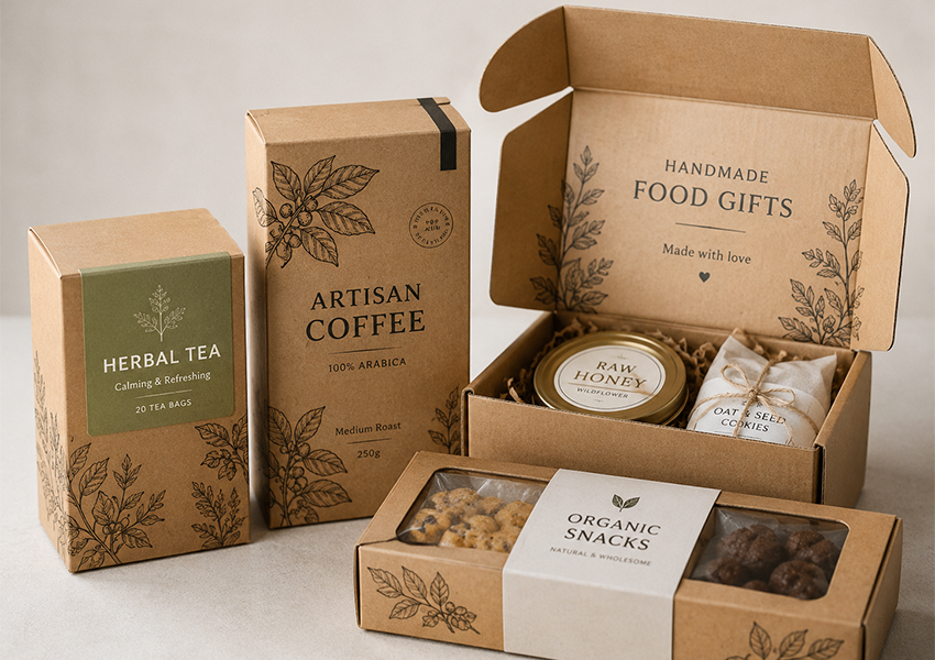
Hay una razón por la que el papel kraft aparece con tanta frecuencia en las marcas de alimentos orgánicos y artesanales: ese papel crudo, El aspecto sin teñir hace gran parte del “natural” Contar historias antes de que un cliente lea un solo ingrediente.. Las marcas que se inclinan mucho por esa historia a menudo combinan papel kraft con Certificado FSC abastecimiento, ya que un mensaje de sostenibilidad impreso en papel que no se remonta a bosques gestionados responsablemente tiende a debilitarse a sí mismo.
Encaja naturalmente con:
- Aperitivos orgánicos
- Té de hierbas
- galletas hechas a mano
- dulces naturales
- café artesanal
- frutos secos
- pequeños productos de panadería
- Sets de regalo estilo granja
Combinado con tinta blanca o negra, Ilustraciones de lineas simples, y un diseño mínimo, El papel kraft se lee cálido y sencillo.. Pero no es una solución universal: los colores brillantes pierden fuerza contra la base marrón., El texto pequeño puede perderse sin un fuerte contraste., y la impresión con muchas fotografías rara vez se ve nítida en una superficie sin recubrimiento. Las marcas que buscan precisión de color o detalles fotográficos suelen obtener mejores resultados con cartón blanco o estucado..
Impresión y acabado: A dónde debería ir realmente el presupuesto
El espacio de impresión es la razón principal por la que muchas marcas eligen cajas de papel en primer lugar: es un espacio tanto para la marca como para la información que los clientes realmente necesitan antes de comprar..
El conjunto de herramientas habitual incluye:
- Impresión en color CMYK o Pantone
- Mate, brillo, o laminación suave al tacto
- Punto UV
- Estampado de láminas
- Estampado o grabado
- parcheo de ventanas
- Íconos e ilustraciones con temas gastronómicos.
El truco consiste en hacer coincidir el acabado con el precio.. Una caja de refrigerios económica no necesita estampado de papel de aluminio, debe ser colorida, legible, y barato de producir en volumen. Un regalo de té premium, por otro lado, Realmente podría beneficiarse de un toque de papel de aluminio y un relieve sutil.. Una marca de alimentos naturales a menudo parece más prima con simple, impresión sobria en textura kraft que con laminación pesada apilada encima.
Y no importa lo bien que se vea el diseño., lo esencial: nombre del producto, sabor, cantidad, instrucciones de almacenamiento, etiquetado requerido: debe permanecer legible. Una hermosa caja que esconde su propio panel nutricional detrás de un tipo decorativo no está haciendo su trabajo.
Estructura de caja coincidente con el producto
La estructura correcta depende del peso., tamaño, y dónde se venderá el producto, no solo qué forma se ve mejor en una maqueta.
Cajas plegables con extremo plegable — bocadillos ligeros, bolsitas de té, palitos de café, pequeños paquetes de dulces.
Cajas inferiores con bloqueo automático — productos más pesados que necesitan soporte inferior adicional.
Cajas de manga - barras de chocolate, bandejas de merienda, y cualquier cosa empaquetada dentro de una bandeja interior.
Cajas de cajón — té premium, café, chocolate, y juegos de regalo que se benefician de una apertura más lenta.
cajas de regalo rígidas — obsequios de comida de lujo, embalaje del festival, regalos corporativos.
Cajas de cartón corrugado – juegos de regalo de comida de comercio electrónico y cajas de suscripción que necesitan sobrevivir a un camión de reparto.
Si se equivoca en esta coincidencia, el costo aparecerá más tarde, en productos dañados., líneas de embalaje lentas, o un cliente abriendo una caja aplastada.
Estante minorista vs.. Caja de comercio electrónico: Dos trabajos diferentes
Muchas marcas de alimentación venden en ambos canales., Y vale la pena recordar que el embalaje realiza dos funciones diferentes según dónde aterrice..
En un estante físico, el panel frontal debe ganar en un par de segundos: visibilidad, comparación clara, el reconocimiento instantáneo es lo más importante. En una caja de envío, las prioridades cambian: ¿Puede sobrevivir siendo apilado?, abandonó, y empujado durante dos días en un camión?
Una caja que luce perfecta en un estante a menudo necesita respaldo para el comercio electrónico: una caja de envío exterior, inserciones para evitar que las cosas se muevan, protección de esquinas, barreras contra la humedad, sellos a prueba de manipulaciones. Esto es aún más importante en el caso de los juegos de regalo., donde los clientes esperan que la caja llegue exactamente como se fotografía, no abollado en una esquina.
Errores que socavan silenciosamente el buen embalaje
Algunos errores recurrentes aparecen una y otra vez en los proyectos de cajas de papel para alimentos:
Asumir la seguridad en contacto con alimentos sin verificar. No todos los cartones, tinta, o el adhesivo está aprobado para el contacto directo con los alimentos; eso debe verificarse antes de la producción, no después.
Sobredimensionar la caja. Una caja demasiado grande hace que el producto parezca escaso e infla el costo de envío sin ningún beneficio..
Saltarse el embalaje interior. para bocadillos, té, y café especialmente, el envoltorio interior suele ser lo que realmente protege la frescura; no se debe pedir a la caja exterior que haga ese trabajo por sí sola.
Texto de bajo contraste. Tinta oscura sobre papel kraft., o letra pálida sobre un fondo ajetreado, puede hacer que la información requerida sea difícil de leer.
Acumulación de acabados premium. El papel de aluminio más los rayos UV, la textura pesada y el relieve suelen parecer desordenados., no es lujoso y cuesta más por un peor resultado.
Ignorar cómo se encuentra realmente la caja en un estante.. Algunas cajas se encuentran, algunos yacen planos, algunos se cuelgan: el panel gráfico principal debe coincidir con la orientación real de la pantalla, no sólo queda bien tumbado sobre una mesa de diseño.
Olvidar por completo el tramo de envío. Una hermosa caja de regalo aún necesita sobrevivir al viaje hasta la puerta de alguien.
Pensamientos finales
Las cajas de papel siguen ganándose su lugar en los envases de alimentos porque realizan varias funciones a la vez — estructura, espacio de marca, organización del producto, presencia en los estantes. Las cajas de refrigerios agrupan varios artículos y comunican el sabor rápidamente. Las cajas de té se inclinan hacia la calma, natural, o posicionamiento premium. Las cajas de café dejan espacio para el nivel de tueste y las notas de sabor.. Las cajas de regalo ralentizan toda la experiencia y la hacen sentir considerada..
Nada de eso significa optar por la opción más colorida o cara disponible.. La caja de papel para alimentos adecuada es simplemente aquella que se adapta al producto real: sus necesidades de frescura., su canal de ventas, su ruta de envío, y dónde la marca quiere ubicarse en la mente del cliente. Antes de encerrar una estructura, vale la pena preguntar claramente: ¿La comida toca la caja directamente?, ¿Necesita embalaje interior?, ¿Cómo se mostrará?, y cómo llegará realmente al cliente?
Responde honestamente, y el embalaje tiende a cuidarse solo.
Trabajar con un fabricante de envases
Antes de saltar a la costumbre caja de papel para alimentos desarrollo, Es útil tener lo básico listo: tamaño del producto., peso, cantidad, canal de ventas, tipo de embalaje interior, dirección de diseño, y cualquier requisito material.
También vale la pena aclarar de antemano si la caja será un paquete exterior o un paquete de contacto directo con los alimentos., ya que esa única decisión da forma a la elección material, método de impresión, revestimiento, y requisitos de cumplimiento. Un buen fabricante de envases. puede caminar a través de la estructura, papel, impresión, diseño de ventana, insertos, y pruebas de muestra antes de comprometerse con una producción completa.