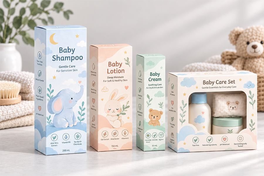
ほとんどの人に梱包の目的を尋ねます, そして彼らは二つのことを言います: 製品を保護する, 売れるようにする. けっこうだ. しかし、軽食の通路を歩いたり、紅茶ブランドのショップページをスクロールしたりしてみてください。, そして、パッケージングが静かにさらに多くのことを行っていることに気づくでしょう - 言葉を読む前に何が入っているかを知らせます, これが火曜日の午後のおやつなのか、それとも誰かの義母への贈り物なのかをほのめかす, あるブランドのクッキーを隣のブランドと全く似せないものにする.
それが紙箱がなくならない大きな理由です, フレキシブルパウチやシュリンクラップのオプションがすべて存在する場合でも、. 折りたたまれたカートンはブランドに実際の表面積を与え、印刷する余地を与えます, 説明する余地がある, 見える部屋 何か 何もないよりは. バッグと無地のラベルが同じキャンバスを提供することはほとんどありません.
問題は、食べ物は携帯電話のケースやキャンドルとは違うということです. 独自の懸念事項リストが付属しています - 湿気, 油, 香り, 貯蔵寿命 , そして場合によっては, 食品との接触に関する厳格な規則. そのため、スナックやコーヒー製品の紙箱だけが包装層ではないことがよくあります。; 通常はインナーバッグと併用して使用します, ライナー, または食品を新鮮で安全に保つ実際の仕事をするトレイ.
バランスを正しく取る, 紙箱は見栄えも良くなります そして 適切に機能する. 誤解してください, そして、古いお茶が入った美しい箱ができあがります. 各スナックの食品紙箱包装にブランドがどのように取り組んでいるかは次のとおりです。, お茶, コーヒー, そして贈り物.
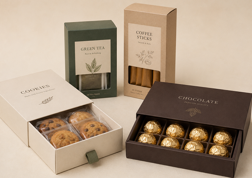
なぜ紙箱が食品にとって依然として意味があるのか
明らかな理由は印刷スペースです. 栄養パネル, 認証, 醸造説明書, フレーバーノート, 創業者のストーリー — 折り畳みカートン 乱雑に見えることなくすべてを持ち運ぶことができます, バッグに貼られた小さなステッカーでは剥がれないもの.
整理整頓効果もあります. ティーバッグがいっぱい入った箱, コーヒースティック, または包装されたチョコレートは意図的に見える. 同じアイテムがバッグの中に放り込まれていると、思いついたように見えます. 贈り物の場合、その構造はさらに重要です。無地のポーチに入った缶入りの紅茶には、次のように書かれています。 “製品。” 印刷された引き出しボックス内の同じ缶には次のように書かれています。 “贈り物。”
そして紙は素材として柔軟性があります, 忘れやすいのは. 素朴でオーガニックなクラフト紙. コーティングされたホワイトボードはインクを美しく取り込み、プレミアムな印刷ジョブを実現します. 段ボール在庫は出荷に耐えられる. 1 つのマテリアル ファミリ, いくつかの完全に異なる外観.
はっきり言っておきたいことが一つある: 紙箱は紙でできているからといって自動的に食品に安全であるわけではありません. 食品が箱に直接触れる場合, 板紙, インク, コーティング, 接着剤もすべてその接触に適している必要があります。 FDA 米国と 欧州委員会 どちらも食品と接触する包装材料を検証が必要なものとして扱っています。, 想定されていない. 正直に, ほとんどのおやつに, お茶, とコーヒー製品, 箱を外層にし、内側の包装紙や袋で食品に安全な部分を扱う方が簡単で安全です.
スナック: 素早い意思決定には素早いコミュニケーションが必要
ワインのボトルについて考えるように、クッキーの袋について熟考する人はいません. スナックのパッケージには、風味というメッセージが届くまでに 2 ~ 3 秒かかる場合があります。, 量, 雰囲気 — 誰かの手が次の棚に移る前に.
紙箱がひっきりなしに現れる:
- あめ
- ビスケットとクッキー
- クラッカー
- ナッツとドライフルーツ
- チョコレートバー
- グラノーラスナック
- マルチパックスナック詰め合わせ
- 個別包装されたおやつ
1 箱に複数の小さなパックが入っている場合
6 つのフレーバーが入ったクッキーのバラエティ ボックスを考えてみましょう, それぞれ個別に袋詰めされています, 全員が 1 つの印刷されたカートンの中に収まっています. あの外箱はただの入れ物じゃない; それは販売を行っている. フレーバーの名前はここにあります, の “6 中の品種,” 各バッグの中身を示す小さなイラストはすべて生きています. このセットアップはギフトショップでよく見かけます, スーパーマーケットのエンドキャップ, 顧客が各商品を物理的に手に取って確認することができないオンライン スナック バンドル.
読む代わりに色分けする
人々の予想よりも効果的な小さなトリックをご紹介します: 並べ替えは色に任せましょう. 緑色は通常、抹茶またはミントを示します. 赤身のイチゴとかスパイシーなもの. 茶色はチョコレートまたはコーヒーと読みます. 5 フィート離れた場所から棚をざっと眺めている人は、単語を 1 文字も読む前にその味を特定できます。, 衝動買いをもとに作られたカテゴリーの中で, 基本的にゲーム全体です.
窓: 見せる, ただ伝えるだけではない
見た目を重視した商品の場合 艶やかなチョコレート, カラフルなキャンディー, きれいに茶色になったクッキー — 箱に切り込んだ窓は、どんなコピーライティングよりも説得力のあるものを作ることができます. 秘訣は抑制です: 窓が大きすぎるとボックス構造が弱くなります, 油っぽいものや砕けやすいものには, 食品にはまだ専用の内袋またはトレイが必要です. の ウィンドウに製品が表示されるはずです, 直接触れないでください.
スナックに合わせた構造
タックエンドの折りたたみカートンは軽いもの、つまりクッキー数枚に適しています, 一握りのキャンディー. 重いマルチパックの場合、サポートのために自動ロックの底部が必要になることがよくあります. おやつにちょっと特別感を与えたい? 引き出しボックスは開く速度を遅くし、ちょっとした儀式感を加えます. インナートレイに巻かれたスリーブは、チョコレートバーや各種ピースに適しています。. 構造は、製品が実際に扱われる方法、つまり運ばれる方法と一致している必要があります。, 積み重ねられた, 発送されました, 開いた状態 - レンダリングでどのように見えるかだけではありません.
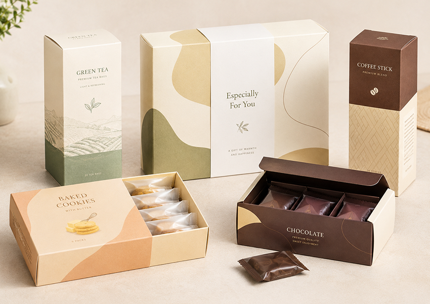
お茶: 落ち着きのあるパッケージング
お茶は味だけでなく気分でも売れます. ウェルネス ティーがグミ ベアの袋の隣にあるように見えることは誰も望んでいません。パッケージはささやかでなければなりません “品質” そして “ケア,” 叫ばないでください.
一般的なお茶の包装作業には次のようなものがあります。:
- ティーバッグ箱
- ルーズリーフ缶用外箱
- ハーブティーサシェボックス
- 抹茶パウダーボックス
- ティーサンプラーセット
- 季節のお茶ギフトボックス
- プレミアムティーコレクション
仕切りが箱を物語に変える
ウェルネス ティー ラインにはモーニング ブレンドが含まれる場合があります, 睡眠ブレンド, デトックスブレンド, そしてプレーンなハーブのオプション — 4 つの非常に異なる製品を 1 つの一貫したセットのように感じる必要があります. 内部の仕切りがその役割を果たします. 4 つのバッグがガタガタと揺れる代わりに, それぞれの品種には独自のコンパートメントがあります, 箱には詰め込まれているというよりは厳選されていると書かれています.
クラフト紙のトレードオフ
クラフト紙はオーガニックティーやハーブティーのブランドに最適です, その理由は簡単にわかります - その暖かさ, 染色されていないブラウンは、光沢のあるホワイトボードとは異なり、正直な印象を与えます。. しかし、それには実際のトレードオフが伴います: 印刷された色は、白いボール紙に比べて、クラフト紙に印刷すると暗く鈍くなります。. アースカラーを基調としたブランドとしては, 植物のスケッチ, あるいは手作り感, それはプラスだ. 明るさを必要とするブランドに, パンチの効いたカラーで忠実に印刷, クラフトは間違った呼び方である可能性があります.
プレミアムティーは拘束を望んでいます, グラフィックスはもう必要ありません
直感に反して, お茶が高価であればあるほど, ボックスの内容が少なくなる傾向にあります. きれいなタイポグラフィー, 単一のエンボスロゴ, 金箔のタッチ, 深いニュートラルカラーの上にマットなラミネートを施すと、その静かな自信が、忙しい雰囲気よりも高級感を与えることがよくあります。, 今までにないカラフルなデザイン.
箱はお茶を新鮮に保つものではありません
お茶は空気や湿気にさらされるとすぐに香りが失われてしまいます. ブランドのストーリーを伝える紙箱; 密封された内袋, 錫, またはポーチが実際に葉を保護する働きをします. 内側のレイヤーをスキップしてください, どんなに素敵な箱でもお茶の劣化は防げない.
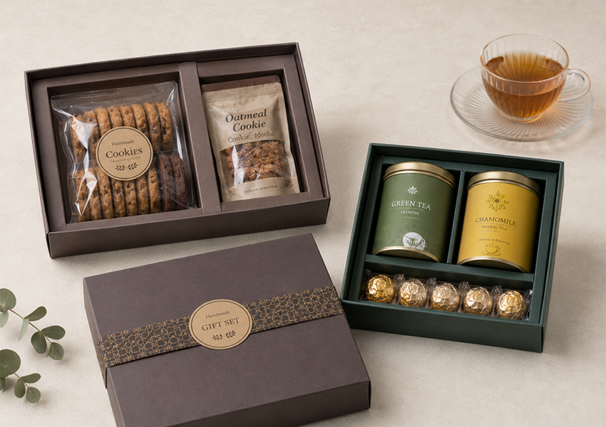
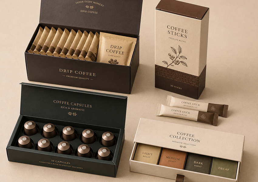
コーヒー: アロマが真の製品となる場所
コーヒー買い物客は味だけでなく香りも求めている, したがって、ここではパッケージングの役割が少し異なります。ローストレベルを反映しながら、その香りを保護する必要があります。, 起源, 棚の上の雰囲気と.
紙箱が登場:
- コーヒースティックボックス
- ドリップコーヒーボックス
- カプセル外箱
- インスタントコーヒーサシェボックス
- コーヒーギフトセットとサンプラー
- 小売用ディスプレイカートン
- 定期購入のコーヒーボックス
スティックとサシェは当然箱に優しいです
通常、各コーヒースティックまたはサシェはすでに個別に密封されているため、, 外側のボックスは自由にコミュニケーションだけに集中できます - ローストレベル, フレーバーノート, スティック数, 醸造方法, 認証, ブランドのバックストーリー. シンプルな折りたたみカートンで、日常の小売店でこれだけの品物を扱うことができます。; 引き出しボックスまたは頑丈な構造により、プレミアムギフトセットがさらに強化されます.
ローストレベルのカラーコードの構築
浅煎りだと柔らかいベージュか黄色になることが多い. ミディアムローストは温かい茶色に座ります. ダークローストは濃い茶色または黒になります. デカフェは、カフェイン入りのラインナップと視覚的に区別するために、青または緑になることがよくあります。. フレーバーコーヒーはその色とフレーバーそのものを結びつけます - バニラ, キャラメル, ヘーゼルナッツ. これらはいずれも法律で義務付けられていません, しかし、複数の SKU のコーヒー ラインが一目で簡単に買い物できるようになります.
ビジーなグラフィックスの上に太字で表示
コーヒーのパッケージは、スナックのパッケージが重視する虹色を無視する傾向があります. 力強いタイポグラフィー, 原点の地図, シンプルな豆のイラスト, すっきりとした幾何学的形状 – より抑制された形状, ほとんど建築的な外観は、製品に対する真剣さを示す傾向があります, 産地や焙煎にこだわるコーヒー愛好家にとって、これは重要なことです.
箱はコーヒーを新鮮に保つことができませんが、バリア包装はコーヒーを新鮮に保ちます
段ボール箱は多孔質です. 酸素や水分がコーヒー粉に到達するのを妨げることはありません, それがまさに時間の経過とともに風味を損なうものです. サシェ, ホイル裏地付きポーチ, またはカプセルがその仕事を処理します; 紙箱はブランディングと小売店での存在感を示すためにあります, 保存ではない. この区別は挽いたコーヒーにとって最も重要です, ドリップバッグ, インスタントコーヒー, およびカプセル - いずれも空気に触れるとすぐに劣化します。.
食品ギフト: 開梱を遅くする
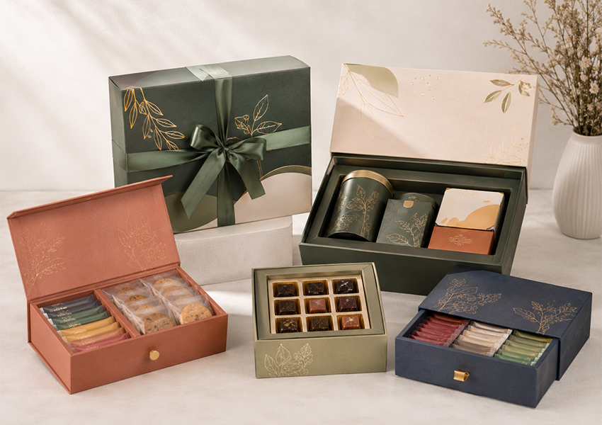
ギフト包装には、日常の小売店の包装とは異なるルールが適用されます. 3 秒以内に棚からギフトボックスを手に取る人はいません。重要なのは、誰かに立ち止まらせることです, オープニングに感謝する, 少し考えたような気がします.
食品ギフトボックスは一般的にカバーされます:
- チョコレートセット
- 紅茶とコーヒーのギフトセット
- クッキーコレクション
- キャンディー詰め合わせ
- ホリデースナックボックス
- ベーカリーギフトボックス
- 法人向け食品ギフト
- お祭りのパッケージ
リジッドボックス 信号 “これには何か費用がかかります”
チョコレートのギフトセットが薄っぺらな折りたたみカートンで提供されることがほとんどないのには理由があります。硬いボードには、薄いカートンでは真似できない重量と構造があるためです。. リフトオフ蓋, 引き出しボックス, ブックスタイルの開口部, 磁気クロージャ - これらはすべて、意図的に開梱を遅くします。, そしてその一時停止こそが、ギフトをギフトらしく感じさせる要因の一部なのです.
インサートは静かな作業を行います
5 つの異なるアイテムが入ったギフトセット — と言う, チョコレートバー2本, お茶缶, それと 2 つのクッキーパック — すべてを所定の位置に保持する何かが必要です, あるいはごちゃ混ぜになって届く. 板紙 インサート, 成型パルプトレイ, フォームカットアウト - 材質を問わず, インサートは実際の製品寸法に合わせて構築する必要があります. 空きスペースが多すぎるため、ボックスが半分空になっているように見えます; きつすぎると圧迫されているように見えます.
休日ごとに 1 つのボックスを再利用する
クリスマスに向けてパッケージをリニューアル, 旧正月, バレンタインデー, 母の日は別々に高くなります. より賢い動き: ニュートラルベースボックスを1つ保持し、季節限定のスリーブに交換します, 腹帯, または毎回タグ付けする. 同じツール, 同じ生産工程, 全く違う季節感.
させないでください “プレミアム” なる “非現実的”
ギフトボックスを過剰に設計するのは簡単です - ボードが重くなると送料が高くなります, 複雑な折り目があると梱包ラインが遅くなる, 特大の箱のせいで、豪華なギフトでも中身がまばらに見える. 最高の食品ギフト包装とは、見た目が特別でありながら、倉庫内での頭痛の種にならないポイントを見つけることです。.
ウィンドウボックス: 製品自体が売れるようにする
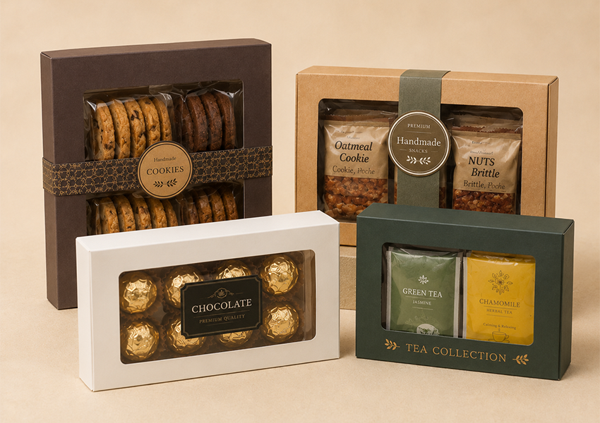
食べ物を売る最も早い方法は、単にそれを見せることである場合もあります. ウィンドウボックスにより、顧客は実際のクッキーを見ることができます, 本物のチョコレート, パッケージを開けずに - 視覚的に魅力的なものに特に適したショートカット.
Windows は頻繁に表示されます:
- クッキー
- チョコレート
- あめ
- お茶のギフトセット
- ベーカリーアイテム
- スナックの詰め合わせ
- 手作り食品
ウィンドウの形状は、表示されているものと一致する必要があります。大きな長方形の切り抜きがクッキーのスタックに適しています。, 小さいうちに, 正確に形作られた窓は、プレミアムチョコレートを数個入れるのに十分です. しかし、ここでは大きいほど良いとは限りません: 材料を切り取りすぎた, そして箱は積み重ねや輸送に耐えるのに必要な剛性を失います。. 他のウィンドウパッケージと同様に、, 食品は通常、食品と窓自体の間に独自の包装紙またはトレイを必要とします。窓には製品が表示されます。, 触れる必要はありません.
クラフト紙: の外観 “丁寧に作られています”
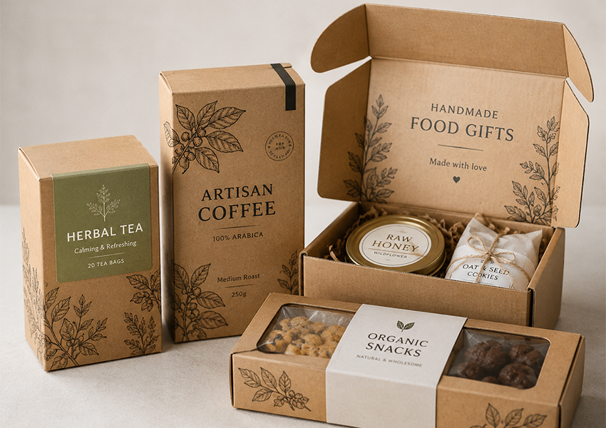
クラフト紙がオーガニック食品や手作り食品のブランドでよく使われるのには理由があります。, 染色されていない外観は多くの効果をもたらします “自然” 顧客が単一の材料を読む前にストーリーテリングを行う. そのストーリーに熱心に傾いているブランドは、クラフトストックと組み合わせることがよくあります。 FSC認証済み 調達, 責任を持って管理された森林を追跡できない紙に印刷された持続可能性のメッセージは、それ自体を損なう傾向があるためです。.
自然にフィットします:
- オーガニックスナック
- ハーブティー
- 手作りクッキー
- ナチュラルキャンディー
- 職人によるコーヒー
- ドライフルーツ
- 小さなベーカリー製品
- ファームスタイルギフトセット
黒または白のインクと組み合わせる, シンプルな線のイラスト, そして最小限のレイアウト, クラフト紙は暖かくて気取らないと言われます. しかし、これは普遍的な解決策ではありません。明るい色は茶色のベースに対してパンチを失います。, 強いコントラストがないと小さなテキストが失われる可能性があります, また、写真の多い印刷は、コーティングされていない表面では鮮明に見えることはほとんどありません。. 色の正確さや写真のディテールを追求するブランドには、通常、白またはコーティングされたボードの方が適しています。.
印刷と仕上げ: 実際に予算をどこに投入すべきか
そもそも多くのブランドが紙箱を選ぶ理由は印刷スペースにあります。これはブランディングと、顧客が購入前に実際に必要とする情報の両方のための不動産です。.
通常のツールキットには以下が含まれます:
- CMYKまたはPantoneカラー印刷
- マット, 光沢, またはソフトタッチラミネート
- スポットUV
- 箔押し
- エンボス加工またはデボス加工
- ウィンドウのパッチ適用
- 食べ物をテーマにしたアイコンとイラスト
コツは価格に見合った仕上げをすることです. 手頃な価格のスナックボックスには箔押しは必要ありません - カラフルである必要があります, 読みやすい, 大量生産が安価. プレミアムなお茶ギフト, 一方で, 箔のタッチと微妙なエンボス加工が本当に恩恵をもたらすかもしれません. 自然食品ブランドがよく見るのは、 もっと シンプルでプレミアムな, 厚手のラミネートを上に重ねるよりも、クラフトテクスチャーへの印刷を抑制.
そして、どんなにデザインが良くても、, 必需品 — 製品名, 風味, 量, 保管方法, 必須のラベル付け - 読みやすくする必要がある. 栄養パネルを装飾的なタイプの後ろに隠した豪華な箱は、その役割を果たしていない.
製品に合わせたボックス構造
適切な構造は重量に依存します, サイズ, モックアップでどの形状が最も美しく見えるかだけでなく、製品がどこで販売されるか.
タックエンド紙器 — 軽いスナック, ティーバッグ, コーヒースティック, 小さなキャンディーパック.
下部ボックスの自動ロック — 追加の底面サポートが必要な重い製品.
スリーブボックス — チョコレートバー, スナックトレイ, 内トレイに詰められたもの.
引き出しボックス — プレミアムティー, コーヒー, チョコレート, ゆっくりと開封することで恩恵を受けるギフトセット.
堅いギフトボックス — 高級食品ギフト, お祭りの包装, 法人ギフト.
段ボール箱 — 配送トラックに耐える必要がある e コマースの食品ギフト セットや定期購読ボックス.
この一致を間違えると、後に損害が発生し、その代償が発生します。, 梱包ラインが遅い, または、潰れた箱を開ける顧客.
小売棚 vs. Eコマースボックス: 2 つの異なるジョブ
多くの食品ブランドが両方のチャネルで販売しています, パッケージングは、どこに着地するかに応じて 2 つの異なる役割を果たしているということを覚えておく価値があります。.
物理的な棚上, フロントパネルは数秒以内に勝利する必要があります — 視認性, 明確な比較, 瞬時の認識が最も重要. 配送用の箱に入っています, 優先順位が逆転する: 積み上げられても生きていけるのか, 落とした, そして二日間トラックの中で押し合いました?
棚に並べると完璧に見える箱でも、多くの場合、e コマース用のバックアップ、つまり輸送用の外装箱が必要になります。, 物事の移動を止めるために挿入します, コーナープロテクション, 防湿層, 不正開封防止シール. ギフトセットの場合、これはさらに重要です, 顧客が写真どおりの箱が届くことを期待している場合, 片方の角が凹んでいない.
優れた包装を静かに台無しにする間違い
食品紙箱プロジェクトでは、いくつかの失敗が何度も繰り返されます。:
食品との接触の安全性を確認せずに想定する. すべての板紙ではありません, インク, または接着剤が食品との直接接触を許可されている - 製造前に確認する必要がある, その後ではない.
箱の特大化. 箱が大きすぎると商品が粗末に見え、送料が無駄に高くなります。.
内箱を省略. おやつに, お茶, そして特にコーヒー, 通常、実際に鮮度を保護するのは内側の包装紙です。外箱だけにその役割を任せるべきではありません.
低コントラストのテキスト. クラフト紙に濃いインク, または賑やかな背景に淡い文字で, 必要な情報が読みにくくなる可能性がある.
プレミアムな仕上げを重ねる. フォイル、UV、重いテクスチャ、エンボス加工は、通常、雑然としたものとして認識されます。, 贅沢ではありません - 悪い結果を招くとより多くの費用がかかります.
箱が実際に棚の上にどのように置かれているかを無視する. いくつかの箱が立っています, いくつかは横たわっています, 若干ハングします - メイングラフィックパネルは実際のディスプレイの向きと一致する必要があります, デザインテーブルの上に横たわって見栄えを良くするだけではありません.
出荷作業を完全に忘れる. ゴージャスなギフトボックスは、誰かの玄関に届くまで生き残る必要があります.
最終的な考え
紙箱は一度に複数の役割を果たすため、食品包装の分野での地位を確立し続けています - 構造, ブランディングスペース, 製品構成, 棚の存在. スナック ボックスは複数のアイテムをグループ化し、風味を素早く伝えます. 静寂に傾く茶箱, 自然, またはプレミアムポジショニング. コーヒーボックスはローストレベルとフレーバーノートのためのスペースを確保します. ギフトボックスは全体の体験を遅くし、配慮されていると感じさせます.
それは、利用可能な最もカラフルなオプションや高価なオプションに手を伸ばすことを意味するものではありません. 適切な食品紙箱とは、単に実際の製品に適合するものであり、その鮮度が必要です。, その販売チャネル, その輸送ルート, そしてブランドが顧客の心の中でどこに位置したいのか. 構造物に固定する前に, はっきりと尋ねる価値がある: 食べ物が箱に直接触れていますか, 内箱は必要ですか, どのように表示されるのでしょうか, そしてそれは実際にどのようにして顧客に届くのか?
それらに正直に答えてください, パッケージングは自動的に処理される傾向があります.
包装メーカーとの連携
カスタムに入る前に 食品紙箱 発達, 基本的なものを準備しておくと役立ちます - 製品サイズ, 重さ, 量, 販売チャネル, 内包装タイプ, デザインディレクション, およびあらゆる材料要件.
また、箱が外側のパッケージになるのか、食品に直接触れるパッケージになるのかを事前に明確にすることも重要です。, その 1 つの決定が素材の選択を決定するため、, 印刷方法, コーティング, およびコンプライアンス要件. 優れた包装メーカー 構造物を通り抜けることができる, 紙のストック, 印刷, 窓のデザイン, インサート, 完全な実稼働を開始する前にサンプルテストを行う.